I've been taking a packaging design course the past month and it's been going very well. It has been A LOT of work, but it's worth it because I'm learning so much and I know I will have awesome portfolio pieces.
The most challenging part of my projects have been the thumbnail sketches. When I first started off in graphic design, I was taught that thumbnail sketches were rough and they could just be elements of a design, not necessarily the whole design. Basically, thumbnails were for the designer's benefit. At AiPOD, they teach us that thumbnails are for the client. In regards to packaging design, the design elements need to be applied to a sketch/template of the package so that the client can get an idea of placement. Why don't all schools teach this? It makes much more sense since we are designing for clients, not ourselves. My thumbnails have improved tremendously over the last 4 weeks and anyone who looks at them can see the direction I am taking.
My first project was a cylinder container with a continuous label; meaning no front, back or sides. The product had to be something that wasn't typically packaged in a cylinder. I chose elbow macaroni noodles. This proved a little more difficult than I thought because I had to break away from the traditional concept of packaging (front, back and sides) and think outside the box. My solution: Repetition. No matter which which way the container was put on the shelf, you would still be able to distinguish important information. I've uploaded a few photos of my cylinder container under Packaging Design.
Our final project is a multi-unit paperboard carrier with clear bottles. Again, the product had to be something that wasn't typically packaged in multi-units. Since I had never designed anything in health & beauty, I chose women's foaming bubble bath and bath salt soak. Before I started designing, I did product profile research on women's bath products based on R.Birds Product Profile. Once I gathered all of my information, I found bottles and created labels. I am currently working on the paperboard carrier, which should be completed in a few days. I will upload photos once the entire project is completed.
I am extremely proud of the work I have produced in this class. Even my professor was impressed by the quality of my work. This has been the hardest course I've had to take in graphic design, but it has been the most rewarding.
Sunday, August 26, 2012
Friday, April 13, 2012
Digital Illustration
I've added a Digital Illustration section. Here you'll find drawings created in Illustrator. For now, they will all be things I've created in school, but as time goes on I will include my just for fun drawings.
I'm having so much fun with all of the new additions to Illustrator CS5. Bravo Adobe! They've included a bunch of new tools that make me more efficient as a designer.
I'm having so much fun with all of the new additions to Illustrator CS5. Bravo Adobe! They've included a bunch of new tools that make me more efficient as a designer.
Friday, April 6, 2012
Wrapping Up Color Theory - Part 3
I completed Color Theory for Print last week with a 98.7%. After 3 or 4 revisions to my final composition, I have a solid piece to add to my portfolio. In case you can't tell, I went with the tetrad color strategy. I really think it captures the depth and energy I was aiming for.


I couldn't just stop with one composition, so I decided to create a series.

Next classes on deck.... Digital Illustration and History & Analysis of Design. I've already taken very similar courses for my last degree, so this 5.5 weeks should be a piece of cake.
Monday, March 26, 2012
Wrapping Up Color Theory - Part 2
Just like I did with the grayscale thumbnails, I did some polling and I believe I am going to go with the Tetrad color strategy. I will re-evaluate it and make adjustments as needed.
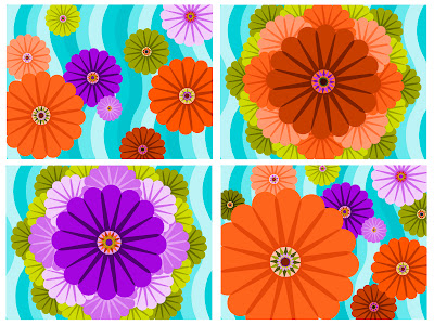
Here is my color study. Which would you use?

Saturday, March 24, 2012
Wrapping up Color Theory - Part 1
Here I am. In my final week of Color Theory for Print. I'm starting to get used to these 5 1/2 week classes. Our final projects are broken down into four parts: written proposal and 4 thumbnails, choosing one composition and apply 4 color strategies, pick one composition and create a final draft, and final project with artist statement.
Here is my part one: written proposal and thumbnails

Here is my part one: written proposal and thumbnails
For my final project, I am using flower-like shapes to
express feelings of excitement and happiness. After building shapes and playing
with the pathfinder options, I came up with this flower with a sun-like
center. I thought it looked kind of
neat, so I decided to this as my subject matter. Also, flowers are naturally
light hearted and can make people smile.
I will put the flowers on a background that will cause excitement and
interest. The background will consist of a pattern that will push the flowers
forward in the design creating depth.
My goal is to create a composition that will excite the
viewer and evoke a feeling of happiness.
It will have a good sense of depth. To get the depth and level of
excitement that I want, I will utilize overlapping shapes, diminishing size,
gravity, tints, shades and tones. Since the subject matter is flowers and the
feeling is happiness, I will stick to warmer colors. I will either use an
analogous or triad color strategy. I think that a tetrad strategy will be the
composition obnoxious and that is not what I am going for.
I am anticipating that my biggest challenge will be finding
the right color strategy for my design. Then once I find the right colors, the
next challenge will be apply the colors to my design using tints, tones and
shades of the colors. The color strategy
will be the most important part of my design because it is going to be
responsible for the majority of the depth. I will overcome these challenges by
using Kuler to choose the colors for my color palette and a combination of the
color picker and blend tool to get the tints, tones and shades.

I believe I will be using the top left design for this project, but that could change after critiques.
Friday, March 23, 2012
Check out my work
I've added samples of my work to the site. Be sure to check them out under the Pages section. They include my professional work, as well as pieces I've created for school.
Sunday, March 18, 2012
Color Theory
For the last four weeks, I have been taking Color Theory in Print at The Art Institute of Pittsburgh Online. Great class! So far I have learned quite a bit about color harmonies, creating depth through color and placement, and color meanings.
I really wish this class was available when I was earning my Associates degree. Seems like it should be a standard course for any degree's or certification's in Graphic Design.
When I get the time I will post a few of my projects on here but I have them on my Twitter.
I really wish this class was available when I was earning my Associates degree. Seems like it should be a standard course for any degree's or certification's in Graphic Design.
When I get the time I will post a few of my projects on here but I have them on my Twitter.
Monday, March 5, 2012
Into to Flash
Thanks to my handy dandy Kindle Fire, I have finally started to learn how to use Adobe Flash. A few years ago, I took a class that included Flash, but it's true what they say... if you don't use it, you'll loose it. I downloaded Adobe Flash Professional CS5: Classroom in a Book and so far so good. I'm working with Flash CS 5.5 and I am noticing small differences between CS5 and CS5.5, but it should only be a minor challenge.
Subscribe to:
Comments (Atom)